Design as a fundraising multiplier: decks, brand, and investor trust
Why startups that invest in design across pitch decks, one-pagers, landing pages, video, and their full brand experience raise more effectively and build investor conviction.
Fundraising is a design problem. Not in the superficial sense of making a pitch deck look pretty—in the structural sense that every artifact a startup produces for investors is a designed experience, whether you treat it that way or not. The pitch deck. The one-pager. The landing page. The product demo. The follow-up email. The data room. Each one is a moment where an investor forms an impression of your company’s clarity, taste, and attention to detail. Most startups treat these as separate, ad hoc deliverables. The ones that raise well treat them as a coordinated brand experience, because that’s what they are.
Why investors read design quality as organizational quality
Investors are pattern matchers. They’ve reviewed thousands of companies, and they develop calibrated instincts for signals that correlate with the things they care about: quality of execution, attention to detail, capacity to ship, and team cohesion. Design quality isn’t aesthetics to an experienced investor—it’s a proxy for organizational quality.
A pitch deck that’s typographically inconsistent, spatially incoherent, and casually assembled signals something: this team either doesn’t notice these things or doesn’t care about them. Either reading is bad. A team that doesn’t notice small execution failures is not going to notice them in their product. A team that notices but doesn’t care has made a judgment call about what matters, and they’ve decided polish doesn’t.
A pitch deck that’s clean, hierarchically clear, and visually consistent with the company’s brand and product signals something different: this team sweats the details, has a shared visual language, and can execute end-to-end. These signals are most powerful when they’re consistent across every investor touchpoint—not just the deck, but the one-pager, the landing page, the product demo, the follow-up materials.
This is why design is a fundraising multiplier: it makes the organizational quality of your team visible in every artifact you produce. You can’t hide execution culture behind good presentation—but you can let bad presentation obscure good execution culture. The downside risk is larger than most founders realize.
What does a well-designed fundraising campaign look like?
A well-designed fundraising campaign has visual and narrative coherence across four artifact categories: presentation materials, digital presence, product demonstrations, and physical touchpoints.
Presentation materials: pitch deck, executive summary, one-pager, financial model deck. These should share a visual language: consistent typography, a coherent color palette, the same approach to data visualization. Not identical—a one-pager and a 50-slide deck are different formats with different requirements—but clearly from the same company, designed by people who made intentional choices.
The pitch deck specifically is a narrative design problem. The structure—problem, solution, market, traction, team, ask—is well-established enough that departing from it confuses investors. But within that structure, the pacing, the visual emphasis, and the information hierarchy are design decisions that determine whether the narrative lands. The slides that deserve emphasis should look different from the supporting slides. The data visualization should clarify, not decorate. The visual language should reinforce the brand promise, not contradict it.
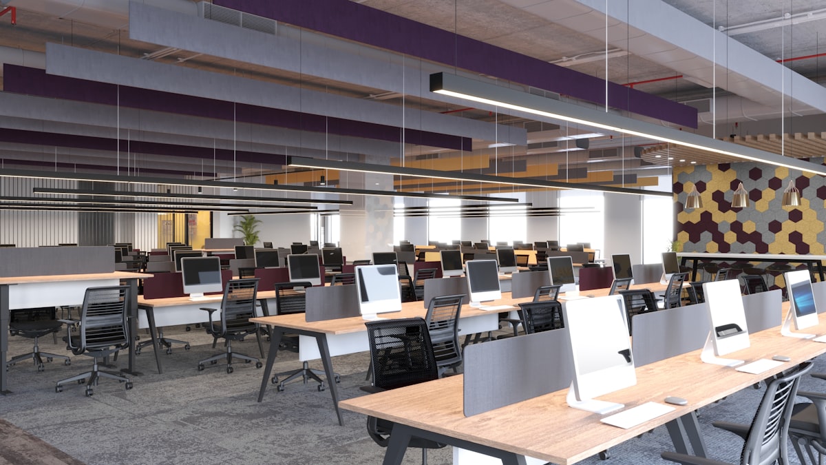
Digital presence: the company website and product, the founder’s professional profiles, any public-facing content (blog posts, press, case studies). Investors will look at all of these. An impeccably designed pitch deck followed by a generic, under-maintained website is a contradiction that erodes the impression the deck built. The website should be the highest-fidelity expression of the brand—it’s the artifact that has the most surface area and the longest engagement time.
Product demonstrations: live demos, recorded walkthroughs, interactive prototypes. These are where design quality is most directly legible. A product that loads fast, handles edge cases gracefully, and has clear interaction patterns signals engineering and design competence simultaneously. A product that crashes or shows loading states that clearly haven’t been designed signals the opposite.
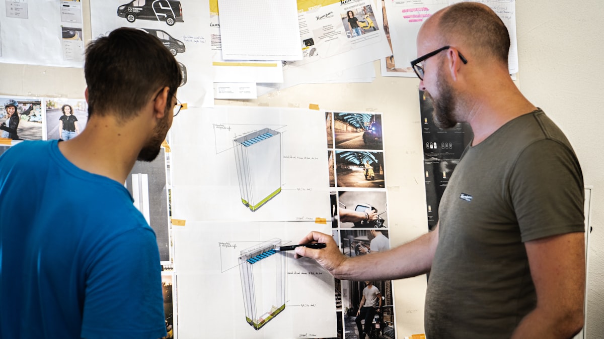
Physical touchpoints: events, investor dinners, in-person meetings. The physical environment design—banners, printed materials, the space itself—sets the tone for in-person interactions. For later-stage fundraises with significant events, physical production quality matters.
How to structure a fundraise as a design project
The biggest mistake I see in startup fundraising is treating design as a late-stage polish step. Founders spend weeks on the narrative and financials, then hand the deck to a designer two days before the meeting. That’s backwards. Design should be embedded from the start: shaping how the story is structured, how data is visualized, how the brand shows up across every format.
Here’s how I structure a fundraising design project when I work with founders:
Week 1: Narrative and structure audit. Before any visual work, review the narrative: Is the problem clearly defined? Does the solution directly address the problem as stated? Is the market sizing credible and well-sourced? Does the traction tell a compelling story? Is the ask concrete and the use of proceeds specific? These are content questions, not design questions. They have to be answered before you design anything.
Week 2: Brand and visual language alignment. What visual language does the company have? Is it documented? Is it being applied consistently? If not, this is the moment to establish or refresh it—not with a full rebrand, but with enough definition that every fundraising artifact looks like it comes from the same place. Fonts, colors, data visualization style, photography or illustration approach.
Week 3: Deck design. With the narrative and visual language set, design the deck. Build it as a system of templates, not a collection of ad hoc slides. The templates should be reusable for future versions—fundraising materials change constantly during a process, and a system of well-structured templates makes updates fast.
Week 4: All other artifacts. One-pager, website updates, demo environment review, physical materials if needed. Each gets the same visual language applied with appropriate format-specific judgment.
The build process for presentation materials has been changed significantly by AI tools. For the workflow that compresses weeks of production into hours using Claude Code and Cursor, shipping landing pages with Cursor, Claude Code, and GitHub covers the pattern that applies equally to fundraising microsites and landing pages.
What makes a pitch deck narrative land?
The narrative design of a pitch deck is a distinct skill from visual design, and it’s worth discussing separately because it’s where most design help falls short.
A pitch deck narrative works when:
- The problem is felt, not stated. Rather than “the market for X is $50B,” show a specific person with a specific problem that this product solves. The investor should feel the problem before they’re told it’s large.
- The solution is specific about the mechanism. What specifically does the product do that others don’t? Not “10x faster” in isolation, but what mechanism makes it 10x faster and why is that mechanism defensible?
- The traction slide tells a story, not just metrics. Show trajectory. Show that the growth has an explanation—a specific thing you did that caused an inflection point. Unexplained growth is less convincing than explained growth at a slower rate.
- The team slide explains why this team, for this problem. Not just credentials, but the specific combination of experiences and perspectives that makes this team the right one to build this specific thing.
- The ask is concrete and the use of proceeds is specific. “We’re raising $3M to hire two engineers, one marketer, and fund 18 months of runway to reach X milestone” is more compelling than “We’re raising to grow the team and extend the runway.”
The visual design of the deck supports this narrative—it doesn’t replace it. Emphasis, pacing, and hierarchy are visual tools for making the narrative land. But no amount of visual design rescues a narrative that doesn’t hold together.
The coherence dividend: what happens when everything looks like it comes from the same company
When every touchpoint—deck, website, one-pager, demo, physical materials—feels like it was designed by the same team with the same standards, an investor forms a specific kind of impression: this is a company that has thought carefully about how they present themselves, which means they’ve thought carefully about how they build their product. The impression compounds with each additional touchpoint.
This is the fundraising multiplier in practice. It’s not that great design makes a bad company look good. It’s that design quality is genuine organizational signal—it reflects how the team thinks about quality, execution, and the experience of everyone who interacts with their work. Investors who have been doing this for twenty years have calibrated instincts for this signal. The coherence is felt, even when it’s not explicitly analyzed.
For the operational side of building this kind of coherent design output across design and marketing—the project management and workflow infrastructure that makes it sustainable—how Head of Design and Head of Marketing actually collaborate covers the systems that produce this consistency at speed.
Key Takeaways
- Fundraising is a design problem at the structural level: every investor touchpoint is a designed experience that builds or erodes conviction, regardless of whether you treat it that way
- Investors read design quality as organizational quality: visual consistency, attention to detail, and execution polish are proxies for the team’s broader capacity to build and ship
- A well-designed fundraise has visual coherence across four categories: presentation materials, digital presence, product demonstrations, and physical touchpoints
- Embed design from week one of a fundraising process—narrative structure and brand alignment before visual execution—not as a last-minute polish pass
- The coherence dividend compounds: each additional touchpoint that feels like it comes from the same company reinforces the impression of organizational quality built by previous touchpoints